
An overview of a software solution that addresses auto repair and the customer journey through a typical visit and successful service experience.
Format: Print, Online
Use: By marketing department to gain customer understanding of how this software fits into their repair shops.
Agency: Ogilvy PR
Brand: Snap-on

An advertising agency in New York was rebranding a regional bank and sought an information graphic that worked with a new style guide. The red and gray act as an anchor and the infographics could be either monochromatic of colorful depending on the format. An icon library was also created by the project.
Format: Digital, Print, Signage
Use: By bank branches
Client: New York-based ad agency
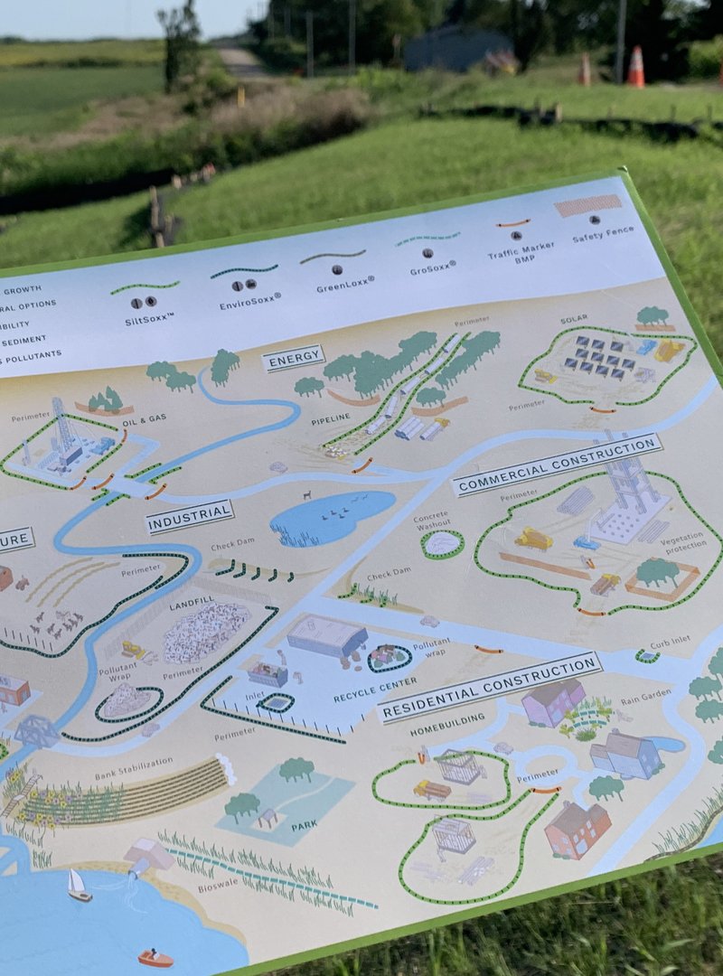
A master overview of a company’s product line that is sold for a broad variety of industries. From construction to oil/gas/solar to pollution control and embankment and landscaping solutions.
Format: Print, Online
Use: By sales force to gain customer understanding of applications and solutions.

The Milwaukee Art Museum reopened with a new wing designed by the famous architect, Santiago Calatrava. This introduced some wayfinding issues and the director of operations reached out to us to create a new map.
The solution provided a three dimensional approach as well as a campus map, to allow visitors to orient themselves according to how the buildings sat on the lakefront.
Format: Print, Digital
Use: Museum visitors, general public, tourism

A printing company requested this graphic because their sales force needed to educate their customers on how their books were made. By having a visual representation of the complexity, financial rationale was easier to communicate and get buy-in.
Format: Print, Digital
Use: Sales materials
Client: Webcrafters, Maddox Design
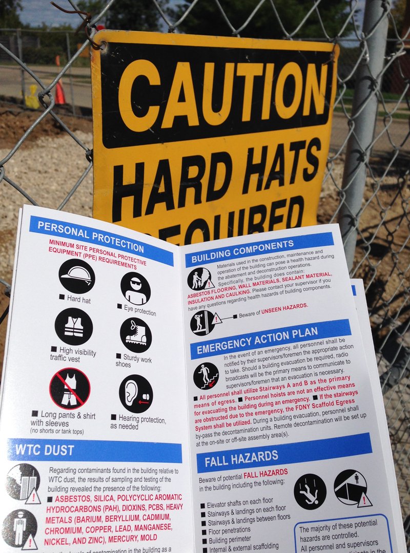
A long Word document was replaced by this 2 language and icon driven design. It visually consolidated safety rules for the demolition of a post 9/11 building at Ground Zero in NYC.
Format: Print (waterproof)
Use: By multi-lingual construction workers on the job site.
Client: An international construction firm.
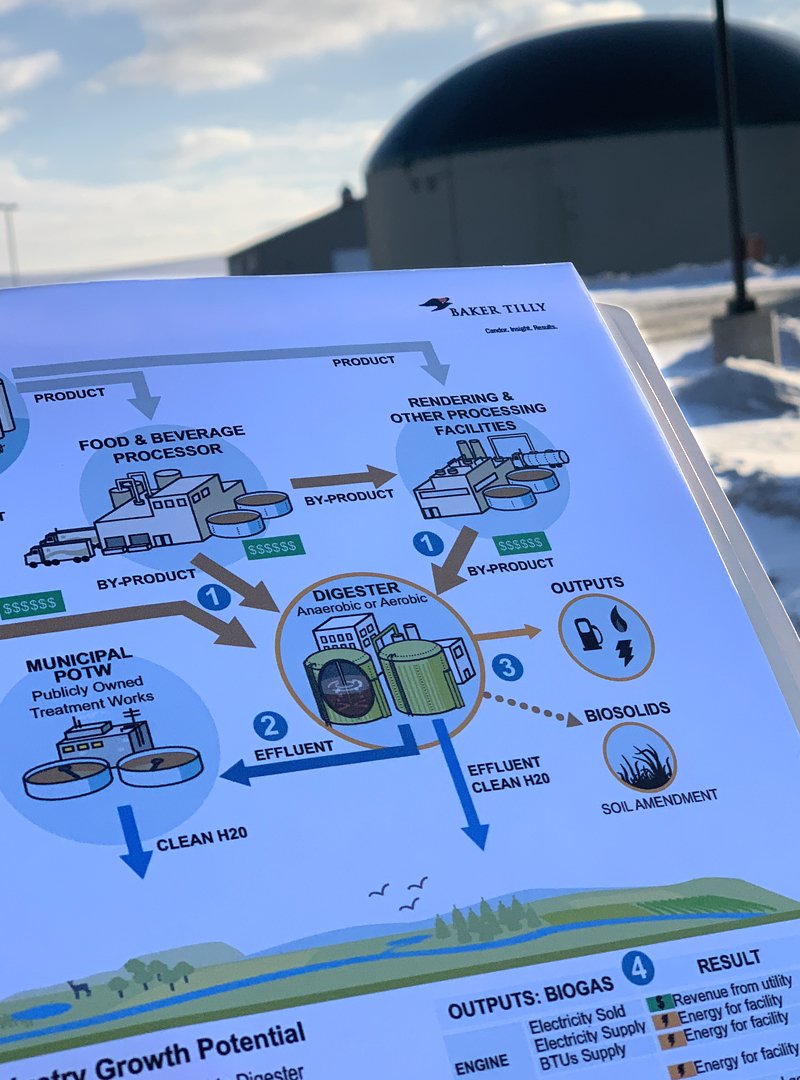
A national accounting firm needed a way to educate their clients on how to take advantage of federal tax incentives for digesters that convert waste to fuel. This allowed their Food Processor clients to understand the U.S. government would help pay for the construction of these multi-million dollar plants.
Format: Print, Online
Use: Client and sales kits. Used during meetings and conversations.
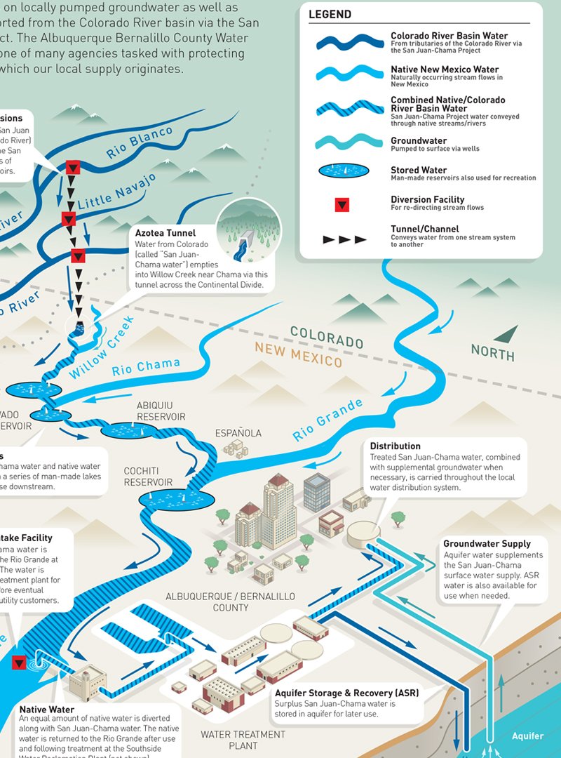
Public water utilities in the Southwest U.S.A. have a problem. Communicating to the public where their water comes from. Especially if it changes from groundwater to sipping out of rivers. This graphic was created as part of the duty of the utility to communicate many details about a switch in sources of drinking water.
Format: Printed poster, Online
Use: Public communication


An overview of a software solution that addresses auto repair and the customer journey through a typical visit and successful service experience.
Format: Print, Online
Use: By marketing department to gain customer understanding of how this software fits into their repair shops.
Agency: Ogilvy PR
Brand: Snap-on
An advertising agency in New York was rebranding a regional bank and sought an information graphic that worked with a new style guide. The red and gray act as an anchor and the infographics could be either monochromatic of colorful depending on the format. An icon library was also created by the project.
Format: Digital, Print, Signage
Use: By bank branches
Client: New York-based ad agency
A master overview of a company’s product line that is sold for a broad variety of industries. From construction to oil/gas/solar to pollution control and embankment and landscaping solutions.
Format: Print, Online
Use: By sales force to gain customer understanding of applications and solutions.
The Milwaukee Art Museum reopened with a new wing designed by the famous architect, Santiago Calatrava. This introduced some wayfinding issues and the director of operations reached out to us to create a new map.
The solution provided a three dimensional approach as well as a campus map, to allow visitors to orient themselves according to how the buildings sat on the lakefront.
Format: Print, Digital
Use: Museum visitors, general public, tourism
A printing company requested this graphic because their sales force needed to educate their customers on how their books were made. By having a visual representation of the complexity, financial rationale was easier to communicate and get buy-in.
Format: Print, Digital
Use: Sales materials
Client: Webcrafters, Maddox Design
A long Word document was replaced by this 2 language and icon driven design. It visually consolidated safety rules for the demolition of a post 9/11 building at Ground Zero in NYC.
Format: Print (waterproof)
Use: By multi-lingual construction workers on the job site.
Client: An international construction firm.
A national accounting firm needed a way to educate their clients on how to take advantage of federal tax incentives for digesters that convert waste to fuel. This allowed their Food Processor clients to understand the U.S. government would help pay for the construction of these multi-million dollar plants.
Format: Print, Online
Use: Client and sales kits. Used during meetings and conversations.
Public water utilities in the Southwest U.S.A. have a problem. Communicating to the public where their water comes from. Especially if it changes from groundwater to sipping out of rivers. This graphic was created as part of the duty of the utility to communicate many details about a switch in sources of drinking water.
Format: Printed poster, Online
Use: Public communication